Best Practices for E-commerce Website Navigation
Posted On: 2024-12-02 18:00:00
Posted By: Mark Johnson
When it comes to e-commerce, a well-structured navigation system can be the difference between a sale and a lost customer. In this guide, we'll explore the best practices to create an intuitive, user-friendly navigation system that enhances the shopping experience and drives conversions. Whether you're just starting or looking to optimize your site, these actionable tips will help you improve usability and boost your bottom line.
Your website navigation is like a map for your visitors. A clear and intuitive navigation system ensures that shoppers can quickly find what they're looking for. Poor navigation, on the other hand, can frustrate users and lead to abandoned carts. Let’s dive into why it’s essential and how to get it right.
Avoid overwhelming users with too many choices. Stick to essential categories and use drop-down menus sparingly to keep the design clean and efficient.
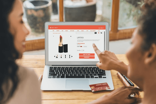
A prominently displayed search bar empowers users to quickly locate specific items. Ensure the search functionality is intuitive and offers predictive suggestions to save time.
Breadcrumbs act as a secondary navigation tool, showing users their current location within your site. This feature is especially helpful for larger catalogs.
With mobile traffic dominating online shopping, responsive navigation is non-negotiable. Your menus should adapt seamlessly to smaller screens, ensuring all users enjoy a smooth experience.
Labels like “Shop Men’s Shoes” or “Discover Summer Sales” are not only clear to users but also optimized for search engines. Avoid vague terms like “Click Here.”
Link relevant pages within your navigation to guide users deeper into your site. This practice also helps search engines crawl and index your content effectively.
Ensure your navigation meets accessibility standards by:
Use data to show personalized product recommendations or recently viewed items. This creates a tailored experience and encourages repeat visits.
Use heatmaps and analytics to identify bottlenecks in your navigation. Regular A/B testing can help you fine-tune the structure for better performance.
E-commerce website navigation plays a critical role in shaping the customer experience. By implementing the practices outlined above, you can make your site more user-friendly, accessible, and effective at driving conversions. Start by simplifying your menu, optimizing for mobile users, and enhancing accessibility to ensure all visitors have a seamless experience.
Ready to create or optimize your e-commerce website? Sign up for a 14-day free trial at Devaito and build a professional site in seconds using our AI-powered tools.
Best Practices for E-commerce Website Navigation
Why E-commerce Navigation Matters
Key Benefits of Optimized Navigation
Essential Elements of Effective Navigation
1. Use a Clear and Simple Menu
2. Incorporate a Search Bar
3. Implement Breadcrumb Navigation
Mobile-Friendly Navigation
Best Practices for Mobile Navigation

Optimizing for SEO and Accessibility
1. Use Descriptive Labels
2. Include Internal Links
3. Make It Accessible
Advanced Tips for Navigation Optimization
1. Personalize Navigation for Returning Users
2. Test and Iterate

Conclusion
Recent Blogs